Feature Interaction Charting#
![]()

This tool is made for quick interactions visualization between variables in a dataset. User can specify the variables to be plotted on the x, y and hue (color) parameters. The tool automatically picks chart type to render based on the detected variable types and renders 1/2/3-way interactions.
This feature can be useful in exploring patterns, trends, and outliers and potentially identify good predictors for the task.
Using Interaction Charts for Missing Values Filling#
Let’s load the titanic dataset:
import pandas as pd

df_train = pd.read_csv('https://autogluon.s3.amazonaws.com/datasets/titanic/train.csv')
df_test = pd.read_csv('https://autogluon.s3.amazonaws.com/datasets/titanic/test.csv')
target_col = 'Survived'
Next we will look at missing data in the variables:
import autogluon.eda.auto as auto

auto.missing_values_analysis(train_data=df_train)
Missing Values Analysis
| missing_count | missing_ratio | |
|---|---|---|
| Age | 177 | 0.198653 |
| Cabin | 687 | 0.771044 |
| Embarked | 2 | 0.002245 |
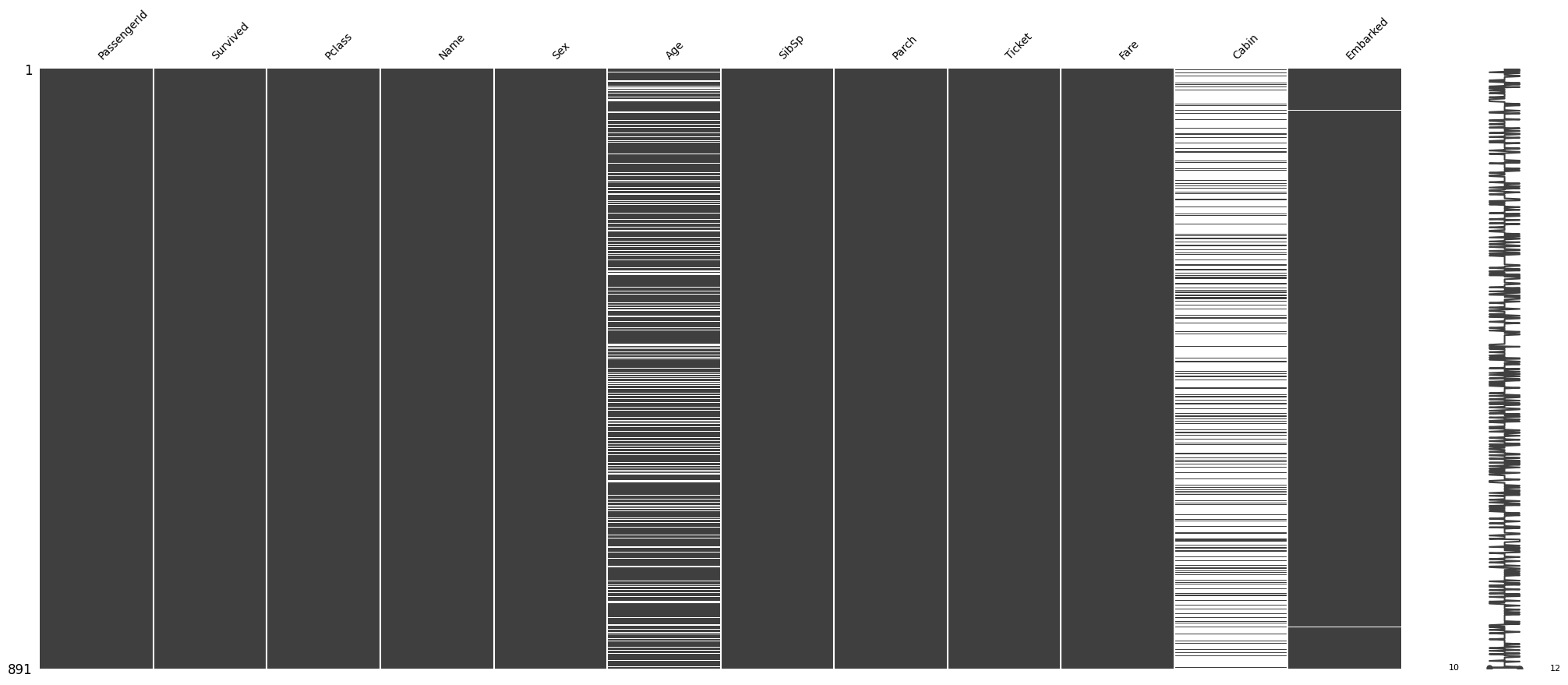
It looks like there are only two null values in the Embarked feature. Let’s see what those two null values are:
df_train[df_train.Embarked.isna()]
| PassengerId | Survived | Pclass | Name | Sex | Age | SibSp | Parch | Ticket | Fare | Cabin | Embarked | |
|---|---|---|---|---|---|---|---|---|---|---|---|---|
| 61 | 62 | 1 | 1 | Icard, Miss. Amelie | female | 38.0 | 0 | 0 | 113572 | 80.0 | B28 | NaN |
| 829 | 830 | 1 | 1 | Stone, Mrs. George Nelson (Martha Evelyn) | female | 62.0 | 0 | 0 | 113572 | 80.0 | B28 | NaN |
We may be able to fill these by looking at other independent variables. Both passengers paid a Fare of $80, are
of Pclass 1 and female Sex. Let’s see how the Fare is distributed among all Pclass and Embarked feature
values:
auto.analyze_interaction(train_data=df_train, x='Embarked', y='Fare', hue='Pclass')
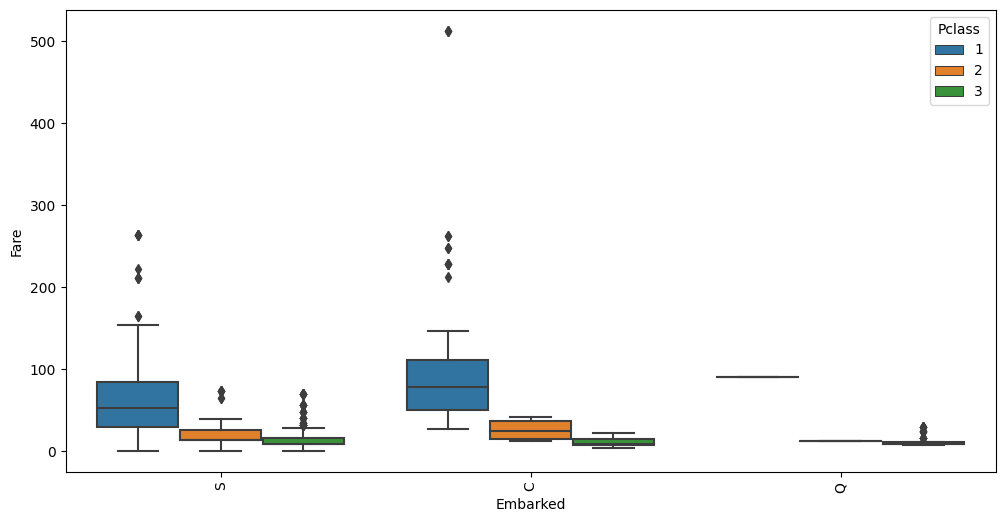
The average Fare closest to $80 are in the C Embarked values where Pclass is 1. Let’s fill in the missing
values as C.
Using Interaction Charts To Learn Information About the Data#
state = auto.partial_dependence_plots(df_train, label='Survived', return_state=True)
No path specified. Models will be saved in: "AutogluonModels/ag-20230327_183056/"
Partial Dependence Plots
Individual Conditional Expectation (ICE) plots complement Partial Dependence Plots (PDP) by showing the relationship between a feature and the model’s output for each individual instance in the dataset. ICE lines (blue) can be overlaid on PDPs (red) to provide a more detailed view of how the model behaves for specific instances. Here are some points on how to interpret PDPs with ICE lines:
Central tendency: The PDP line represents the average prediction for different values of the feature of interest. Look for the overall trend of the PDP line to understand the average effect of the feature on the model’s output.
Variability: The ICE lines represent the predicted outcomes for individual instances as the feature of interest changes. Examine the spread of ICE lines around the PDP line to understand the variability in predictions for different instances.
Non-linear relationships: Look for any non-linear patterns in the PDP and ICE lines. This may indicate that the model captures a non-linear relationship between the feature and the model’s output.
Heterogeneity: Check for instances where ICE lines have widely varying slopes, indicating different relationships between the feature and the model’s output for individual instances. This may suggest interactions between the feature of interest and other features.
Outliers: Look for any ICE lines that are very different from the majority of the lines. This may indicate potential outliers or instances that have unique relationships with the feature of interest.
Confidence intervals: If available, examine the confidence intervals around the PDP line. Wider intervals may indicate a less certain relationship between the feature and the model’s output, while narrower intervals suggest a more robust relationship.
Interactions: By comparing PDPs and ICE plots for different features, you may detect potential interactions between features. If the ICE lines change significantly when comparing two features, this might suggest an interaction effect.
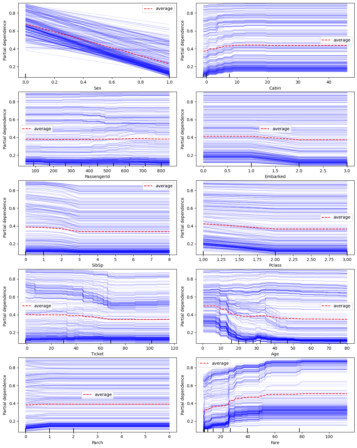
The following variable(s) are categorical: Ticket, Cabin, Embarked. They are represented as the numbers in the figures above. Mappings are available in state.pdp_id_to_category_mappings. Thestate can be returned from this call via adding return_state=True.
A few observations can be made from the charts above:
Sexfeature has a very strong impact on the prediction resultParchhas almost no impact on the outcome except when it is0or1- this is a candidate for clippingFareandAge: both have a non-linear relationship with the outcome;Farehas two modes (density of blue lines) - these are good candidates to explore for feature interaction with other properties
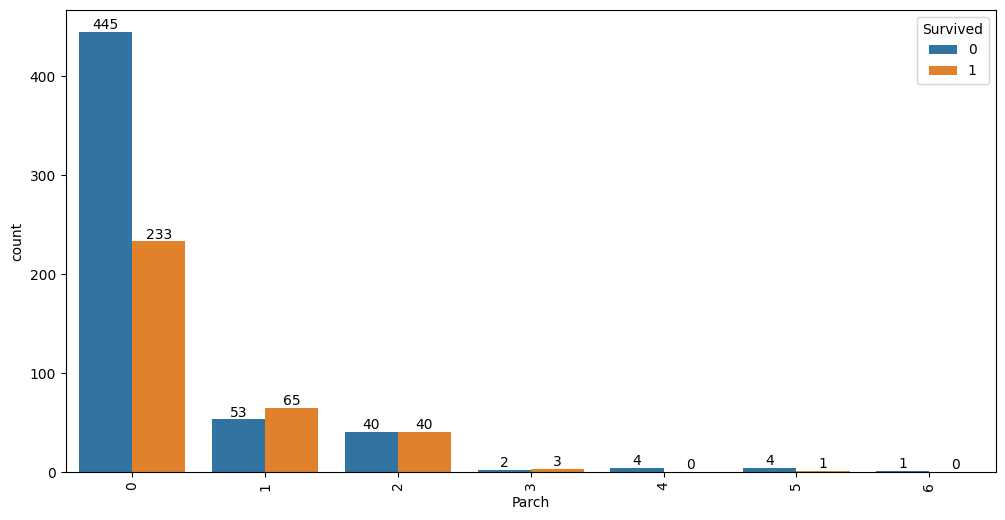
auto.analyze_interaction(x='Parch', hue='Survived', train_data=df_train)
auto.analyze_interaction(x='Pclass', y='Survived', train_data=df_train, test_data=df_test)
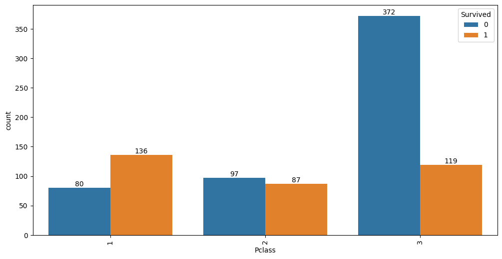
It looks like 63% of first class passengers survived, while; 48% of second class and only 24% of third class
passengers survived. Similar information is visible via Fare variable:
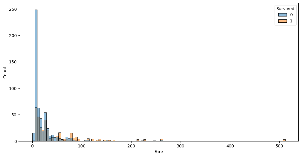
Fare and Age features exploration#
Because PDP plots hinted non-linear interaction in these two variables, let’s take a closer look and visualize them individually and in jointly.
auto.analyze_interaction(x='Fare', hue='Survived', train_data=df_train, test_data=df_test, chart_args=dict(fill=True))
auto.analyze_interaction(x='Age', hue='Survived', train_data=df_train, test_data=df_test)
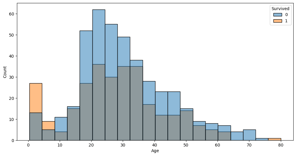
The very left part of the distribution on this chart possibly hints that children and infants were the priority.
auto.analyze_interaction(x='Fare', y='Age', hue='Survived', train_data=df_train, test_data=df_test)
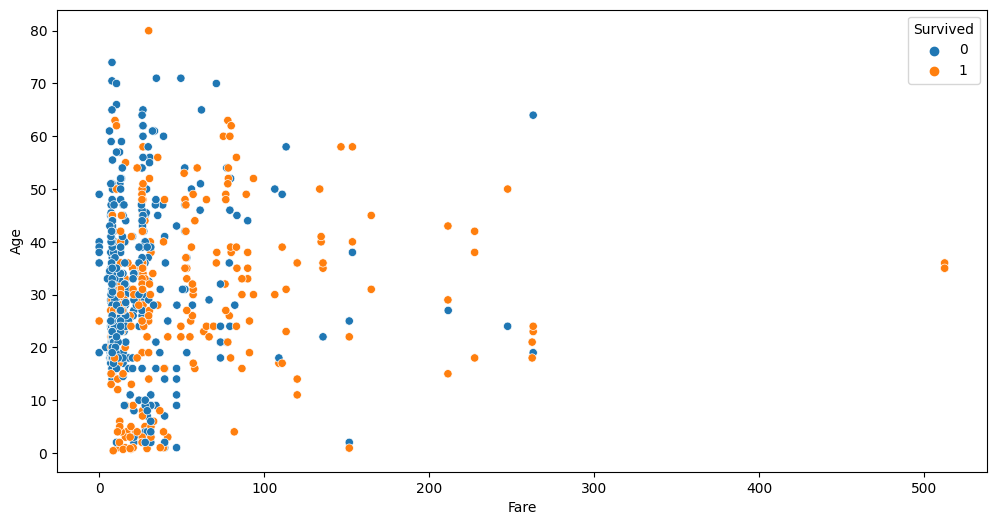
This chart highlights three outliers with a Fare of over $500. Let’s take a look at these:
df_train[df_train.Fare > 400]
| PassengerId | Survived | Pclass | Name | Sex | Age | SibSp | Parch | Ticket | Fare | Cabin | Embarked | |
|---|---|---|---|---|---|---|---|---|---|---|---|---|
| 258 | 259 | 1 | 1 | Ward, Miss. Anna | female | 35.0 | 0 | 0 | PC 17755 | 512.3292 | NaN | C |
| 679 | 680 | 1 | 1 | Cardeza, Mr. Thomas Drake Martinez | male | 36.0 | 0 | 1 | PC 17755 | 512.3292 | B51 B53 B55 | C |
| 737 | 738 | 1 | 1 | Lesurer, Mr. Gustave J | male | 35.0 | 0 | 0 | PC 17755 | 512.3292 | B101 | C |
As you can see all 4 passengers share the same ticket. Per-person fare would be 1/4 of this value. Looks like we can add a new feature to the dataset fare per person; also this allows us to see if some passengers travelled in larger groups. Let’s create two new features and take at the Fare-Age relationship once again.
ticket_to_count = df_train.groupby(by='Ticket')['Embarked'].count().to_dict()
data = df_train.copy()
data['GroupSize'] = data.Ticket.map(ticket_to_count)
data['FarePerPerson'] = data.Fare / data.GroupSize

auto.analyze_interaction(x='FarePerPerson', y='Age', hue='Survived', train_data=data)
auto.analyze_interaction(x='FarePerPerson', y='Age', hue='Pclass', train_data=data)
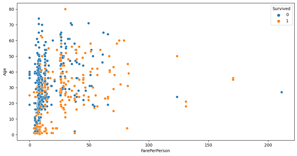
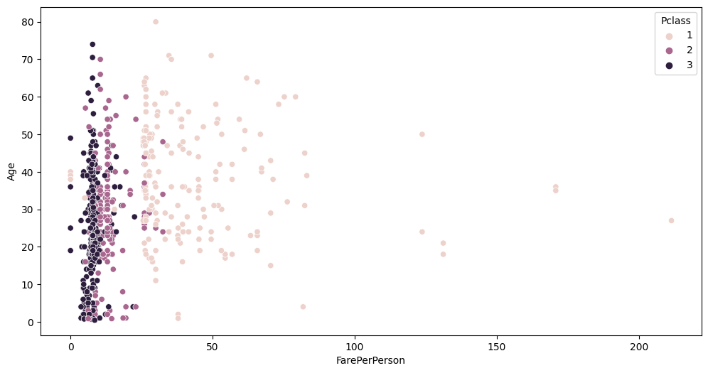
You can see cleaner separation between Fare, Pclass and Survived now.